← All work
DKB Co-Branding white-label credit card platform
Case Study 01 · Fintech · 1.5M+ customers · DKB

DKB, Co-Branding &
White-Label Department

A white-label credit card platform serving 1.5M+ customers across six partner brands and three platforms. Over several years I owned the core cardholder journeys, onboarding, disputes, payments, credit, and built the token-based design system underneath. The result is measurable: App Store rating from 3.2 to 4.7, Customer Satisfaction from 5.6 to 8.9, and less support volume through clearer self-service.

Lead Product Designer Hands-on Delivery Design System Fintech · Regulated
Design Leadership White-label Design System Design Tokens iOS · Android · Web Workshops Onboarding UX Cardholder Journeys Figma

What is the Co-Branding Department?

DKB's Co-Branding department provides white-label credit card solutions for private and business customers in partnership with major consumer brands. Each partner gets a fully branded product, their own card design, app appearance, and feature set, built on a shared, compliant platform. The department runs multiple concurrent product streams: new partner launches, ongoing improvements to existing products, and platform-level infrastructure like the cross-platform UI system.

6+ Partner brands
3.2 → 4.7App Store rating
5.6 → 8.9Customer satisfaction
1.5M+Customers

The work behind the numbers

Every cardholder journey in a regulated credit product is long, branching, and consequential, money, credit, and compliance checkpoints at every turn. My core IC work was taking these journeys apart and rebuilding them so the complexity stays in the system, not in the user's head. Below: how that looks in practice, using the flows that moved the numbers most.

Deep dive: chargeback, a top support driver turned self-service

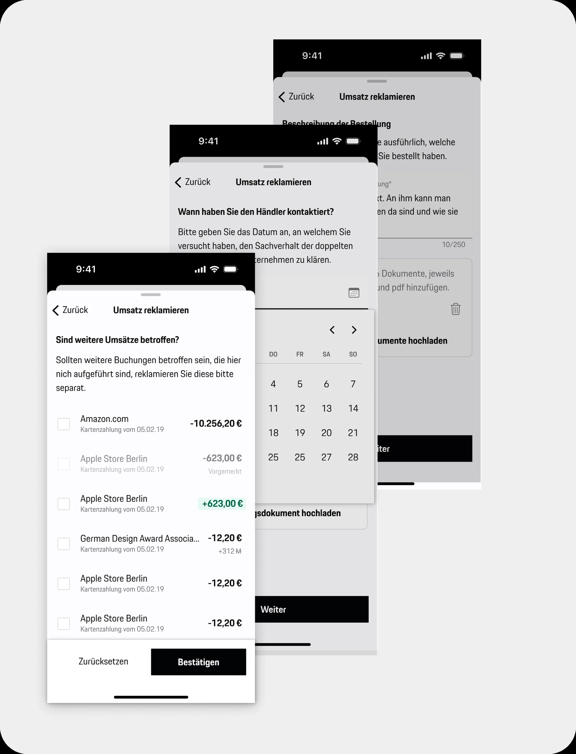
Disputing a transaction is where an annoyed customer meets a legally constrained process. The flow spans 30+ states: transaction selection, reason taxonomy, evidence collection, and a waiting period that used to generate "where is my money?" support calls. First, the full map, then the moments that matter.
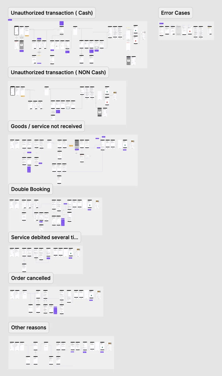
Full chargeback dispute flow map
The full dispute flow, 30+ states across selection, reason, evidence, and status. Complexity is the given; the design job is hiding it.
Chargeback flow on mobile
Zoom: guided intake, one question per step, plain language instead of dispute taxonomy, progress always visible.
Zoom: the flow in motion, prototype of the guided dispute intake.

The outcome logic: guided intake plus proactive status communication turned a top support driver into a flow customers finish on their own, one of the concrete levers behind the support-volume reduction and the satisfaction jump.

Onboarding & card application: where conversion lives

The application journey is the single highest-stakes flow in the product, every abandoned application is a lost customer. It's also compliance-heavy: identity, credit checks, and mandated disclosures can't be removed, only sequenced and framed well. The redesign cut cognitive load per step and made progress and requirements transparent, measurably reducing drop-off.

Full onboarding flow map
The onboarding map, the complete application journey with every compliance checkpoint. Sequenced so momentum survives the mandatory steps.

Revolving credit: designing for consequential decisions

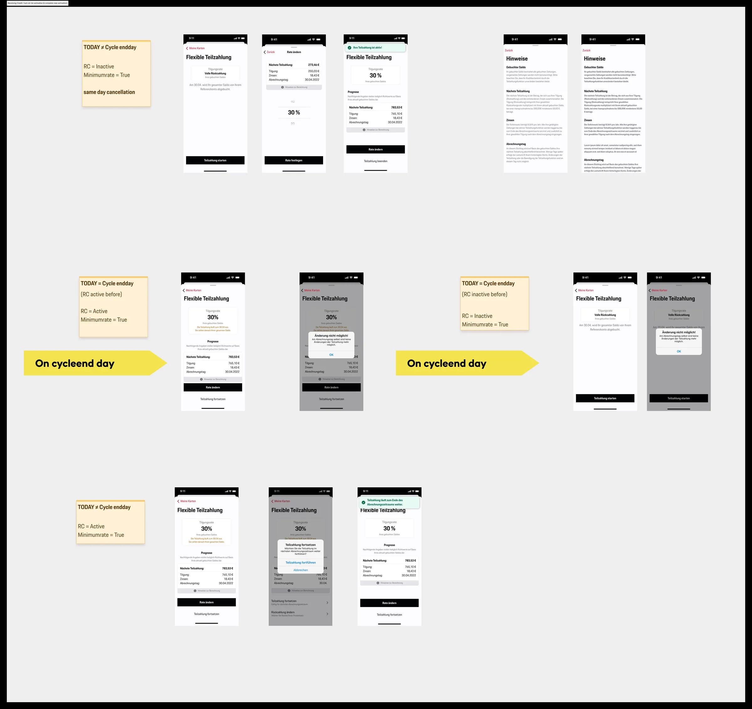
Turning revolving credit on or off is a financial decision with real interest consequences, the opposite of a toggle. The design makes the consequence legible before the commitment: what changes, what it costs, and how to reverse it. Clarity here is consumer protection, not just usability.
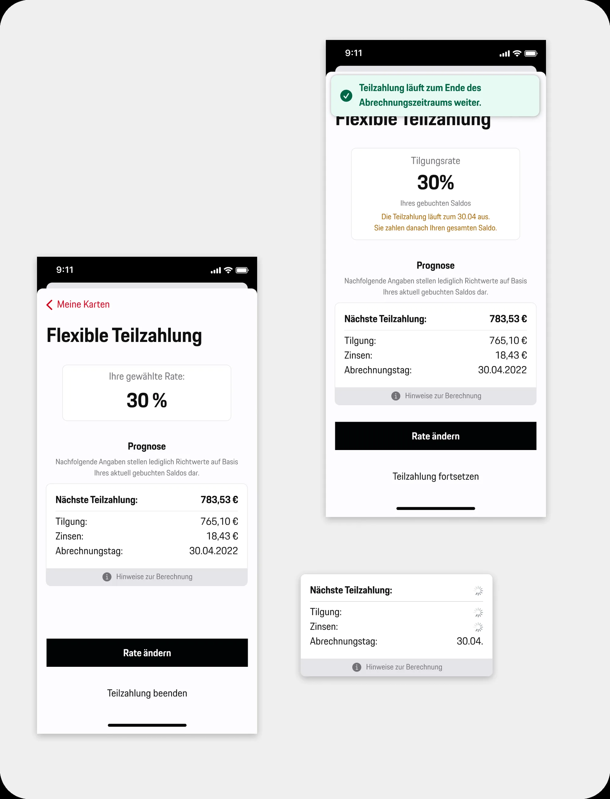
Revolving credit screens
Revolving credit, instalment setup and balance visibility, consequences stated in plain numbers.
Revolving credit activation flow map
Activation and re-activation flows mapped, every state, error, and edge case before a screen was polished.

3-D Secure payments: trust under time pressure

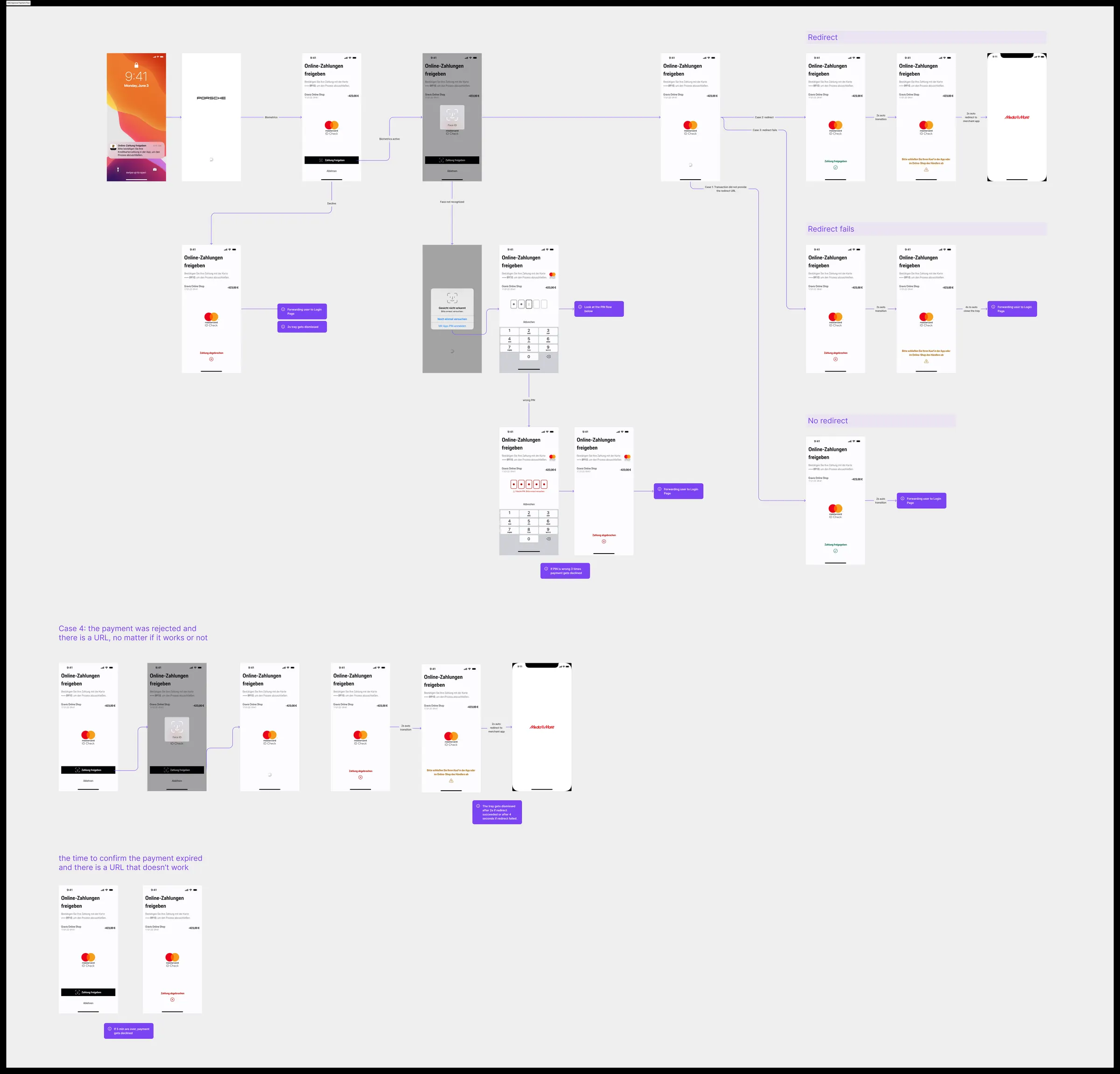
Payment approval is the journey with the least patience: the customer is mid-purchase, the merchant is waiting, and a regulatory authentication step stands in between. The flow had to be instant to understand, hard to fail, and reassuring on security, across every partner brand.
3DS payment approval flow map
The 3-D Secure approval flow, success path, timeouts, declines, and recovery states across platforms.
Flow artefacts shown are abstracted for confidentiality. Happy to walk through the real journeys in a call.

The challenge: one platform, six brands, three platforms

Every partner gets their own branding, colours, logo, card design, and sometimes custom features. But the underlying platform must be consistent, compliant, and maintainable. Without a cross-platform UI system, that means duplication: six brands × three platforms = 18 parallel design maintenance chains, all drifting apart over time. Compliance changes cascade manually. Every partner update requires rebuilding rather than re-theming.

The cross-platform UI system was the infrastructure that made scalable, consistent partner delivery possible.

Token-based architecture

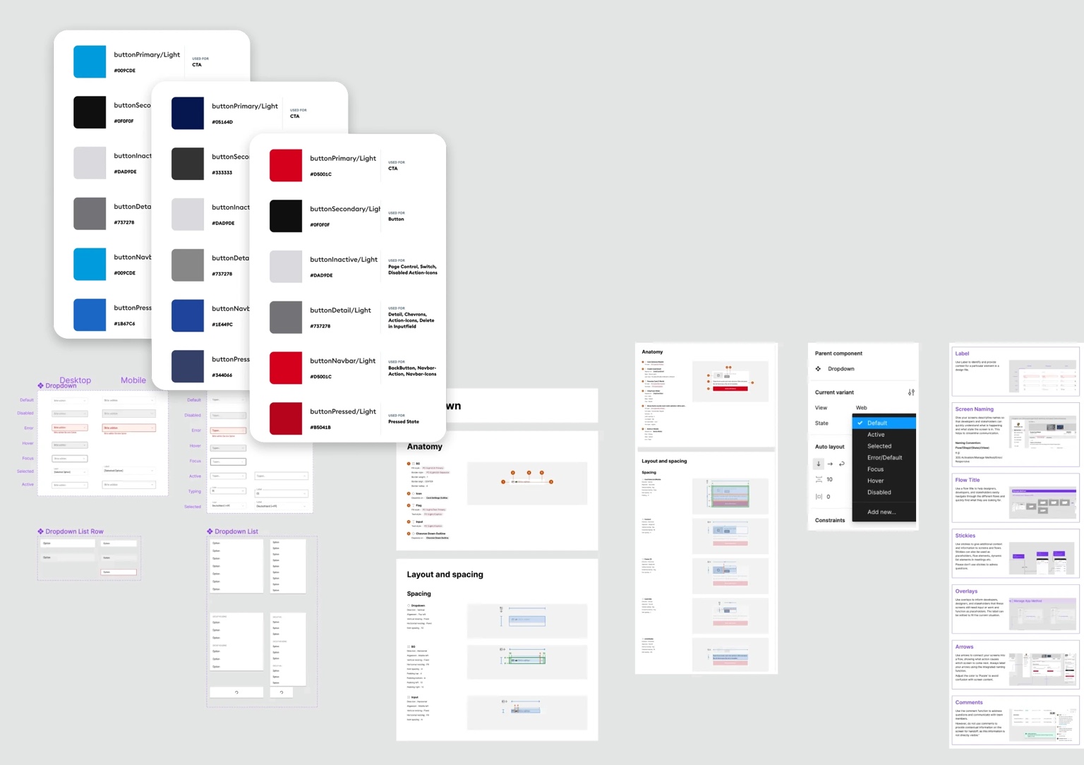
We built a three-layer token system as the foundation. Tokens define design properties, colour, typography, spacing, radius, shadow, as named variables, customised per partner at the brand layer, not the component layer.

  • Global tokens, base palette, spacing scale, type scale. Platform-agnostic primitives.
  • Semantic tokens, map global values to roles: primary, surface, on-surface, error, interactive.
  • Partner tokens, override semantic tokens per brand. One structured swap, not a manual redesign.

A new partner rollout became a theming exercise, not a redesign exercise. This was the central efficiency gain.
Token library
Token library, colour, type, and spacing variables structured for multi-brand theming

Component library, three platforms

Managing a design library across Web, iOS, and Android means balancing platform conventions with cross-product consistency. Each platform has its own interaction patterns and native metaphors, ignoring these produces designs that feel wrong and are hard to build. Ignoring cross-platform consistency produces a fragmented interface experience.

  • Core components defined once, with platform-specific variants, not three separate systems
  • One designer took full ownership of the library, their most significant growth in the team
  • Versioning and cross-platform review rituals kept all three systems in sync over time
  • Documentation standards reduced back-and-forth with engineering on implementation decisions

Impact

  • Significantly faster new partner rollouts, theming replaced manual per-brand redesign
  • Fewer consistency issues in production, cross-platform reviews caught drift before release
  • Engineers had reliable, well-documented specs, reduced ambiguity and rework on implementation
  • New team members onboarded to the design language faster through the shared library
Detailed component specs are confidential. Happy to discuss system structure and decisions in a call.

Multiple products under one roof

This is not a single app with a few variants. The Co-Branding department runs several fully distinct product streams simultaneously, each with its own partner relationship, feature roadmap, compliance requirements, and release cadence. They share a platform and cross-platform UI system underneath, but each is a real product with real users and real business stakes.

Partner
Miles & More
Lufthansa Group frequent flyer credit card. Mileage management, loyalty integration, and cardholder self-service across mobile and web.
Partner
Porsche Card
Premium card for Porsche customers. High-end visual identity, concierge features, and premium UX expectations throughout.
Partner
Hilton Honors
Hotel loyalty card product. Points accumulation, tier tracking, and hotel brand integration across the cardholder experience.
+ more
Additional partners
Further co-branded products across consumer and business card segments. Details confidential.

Mobile banking, branded variants

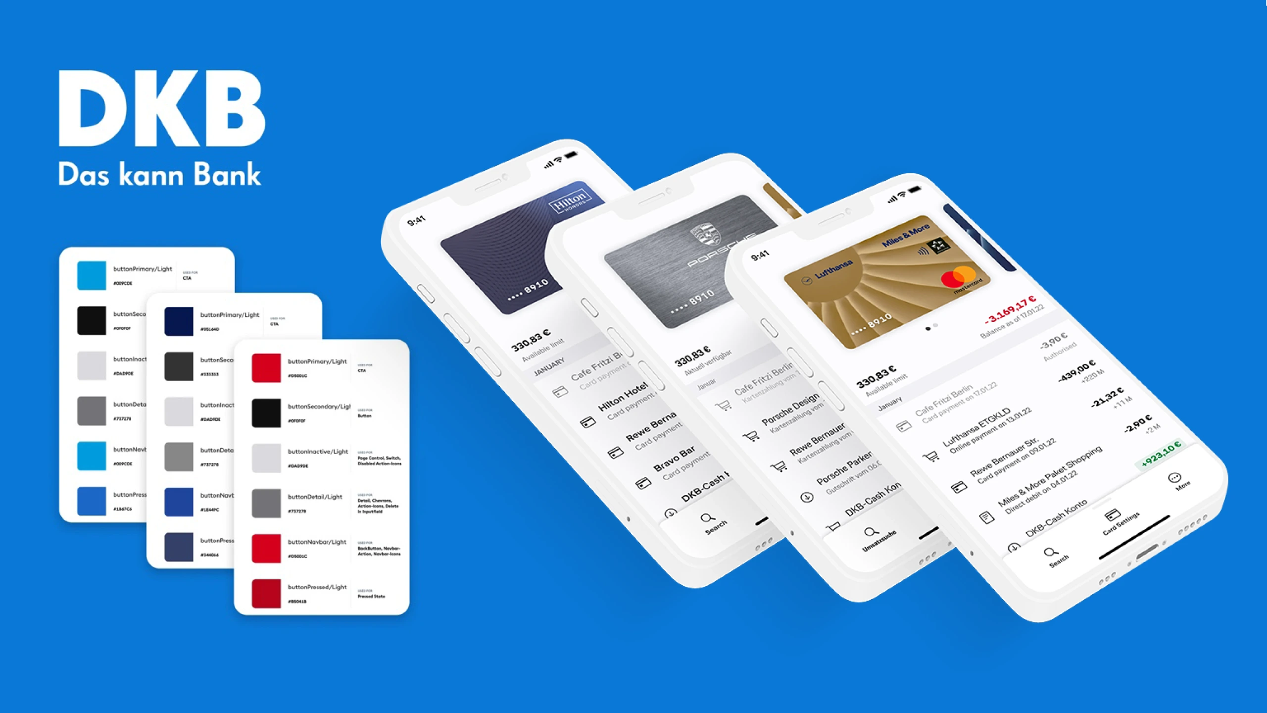
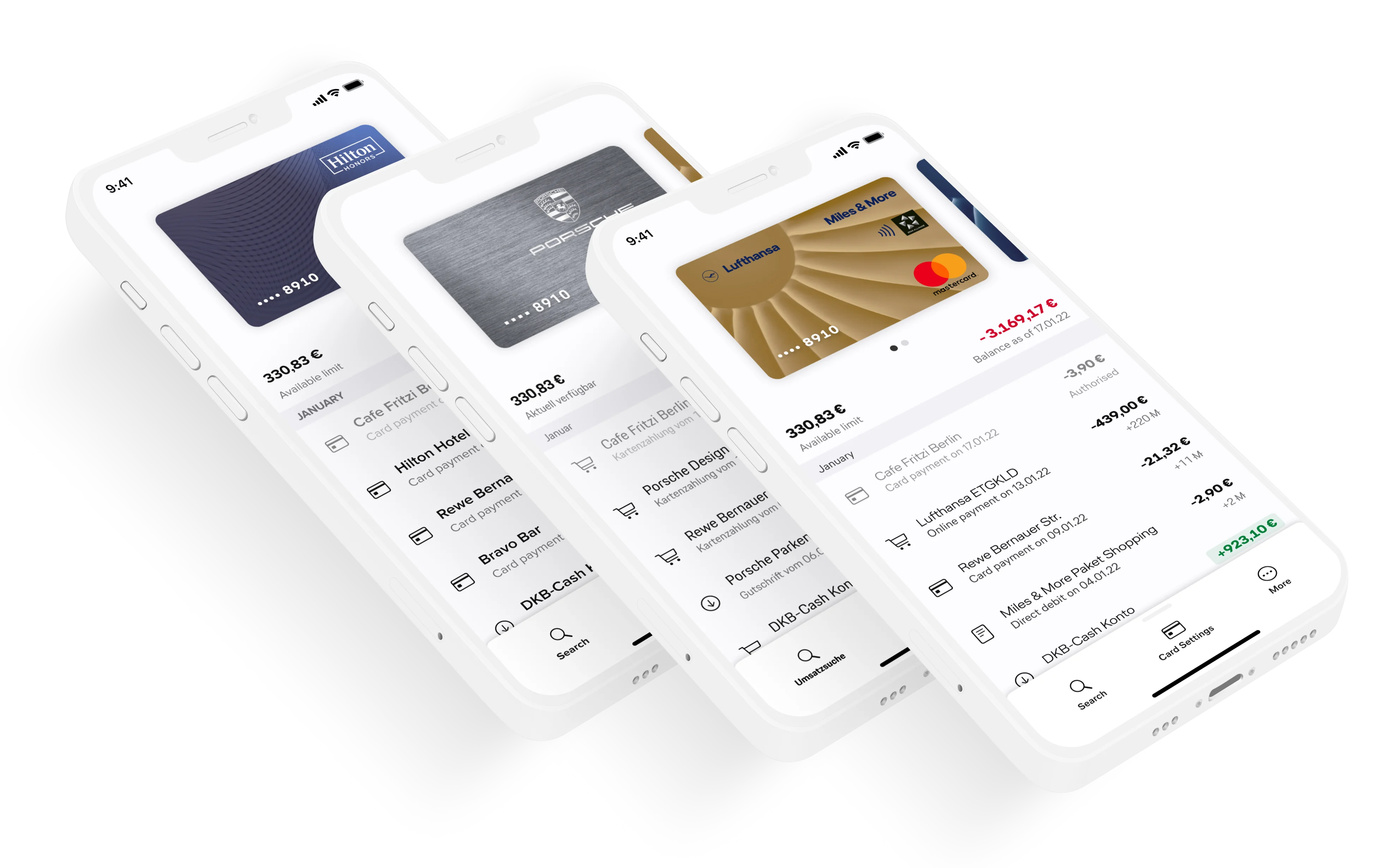
Each partner's mobile app is a fully branded experience, the same platform and component library underneath, a distinct product on the surface. My work covered both the core cardholder journeys shared across all partners and the partner-specific features and brand applications.
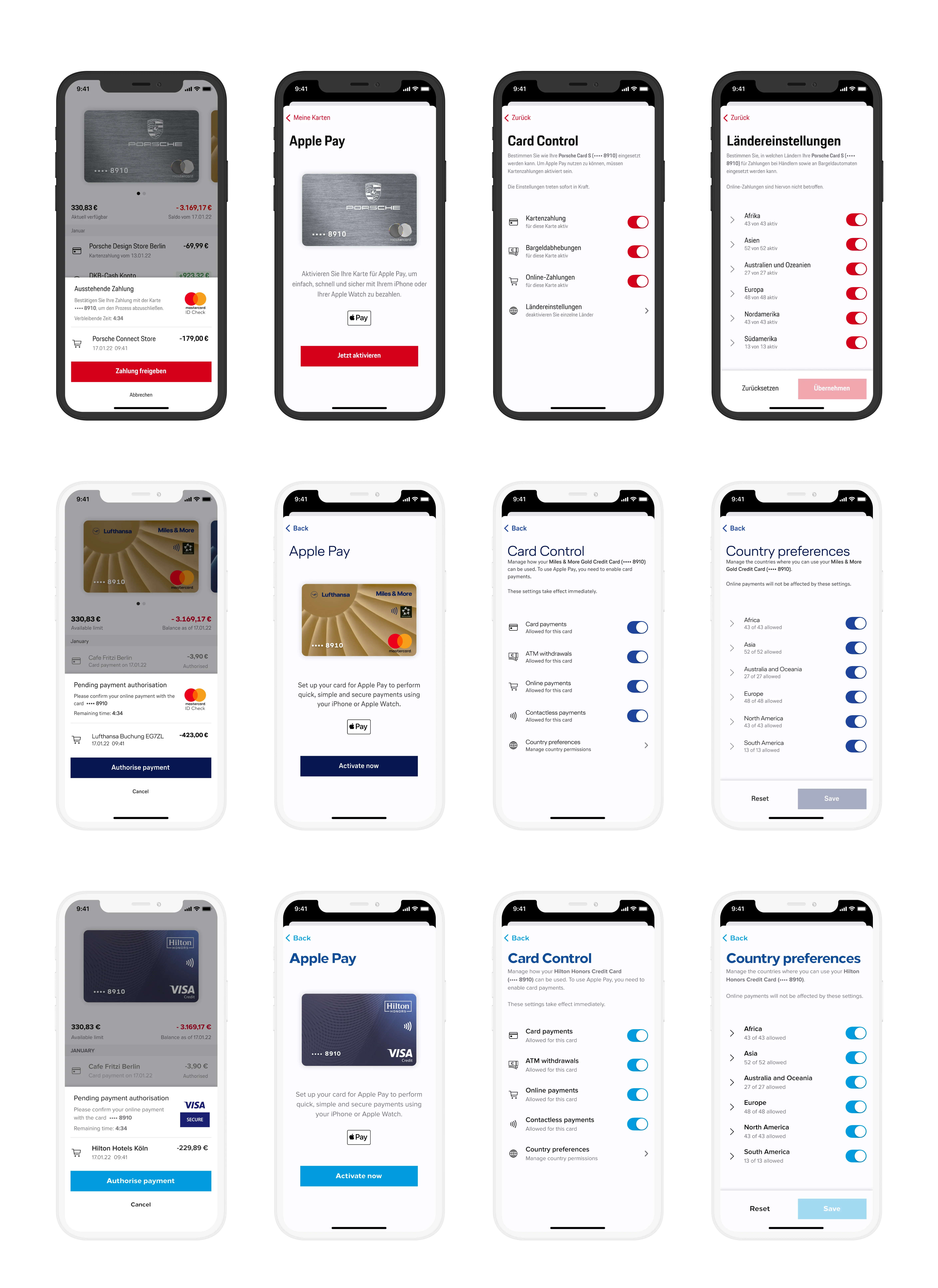
Co-branding overview
Partner brand system, one component set adapting across multiple brand identities through token-based theming
Mobile co-branding examples
Mobile banking UI, the same platform presented as distinct products across different partner brands

Core cardholder journeys

Beyond the visual branding, my main design focus was on the core UX journeys every cardholder goes through, regardless of which partner they're with. These are the highest-stakes flows in the product: where users make decisions about money, credit, and account management under regulatory constraints.

  • Credit card application, multi-step onboarding with compliance-mandated checkpoints and clear progress
  • Card activation, first-use flows for physical and virtual cards across platforms
  • Transaction management, list, filter, category, dispute, and receipt management
  • Card management, PIN, block/unblock, Apple Pay / Google Pay setup, travel notifications
  • Revolving credit, instalment setup, repayment planning, and balance visibility
Detailed flow artefacts are confidential. Happy to walk through onboarding or cardholder journeys in a call.

My role: senior craft first, leadership alongside

I joined as the department's senior designer and stayed hands-on on its most complex design problems throughout, the journeys and system work shown in this case are my IC work. Along the way I also grew the design function: hiring and mentoring two designers, establishing critique and cross-platform review rituals, and representing design in product strategy. The leadership was in service of the work, not instead of it.

The quality bar is set by example, not by instruction.

Complex workflow design

The most demanding IC work involved multi-step workflows with significant branching logic, chat-back flows for dispute resolution, complex card management states, multi-step onboarding with compliance-driven branching, and edge cases that required careful state mapping. These required tight IA, clear error and loading states, and close collaboration with engineering to stay buildable and compliant.
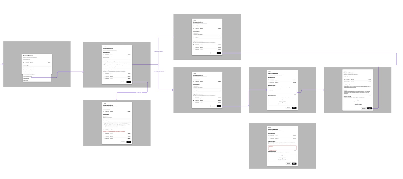
Complex chat-back workflow
Chat-back dispute flow, multi-step branching workflow with clear state transitions
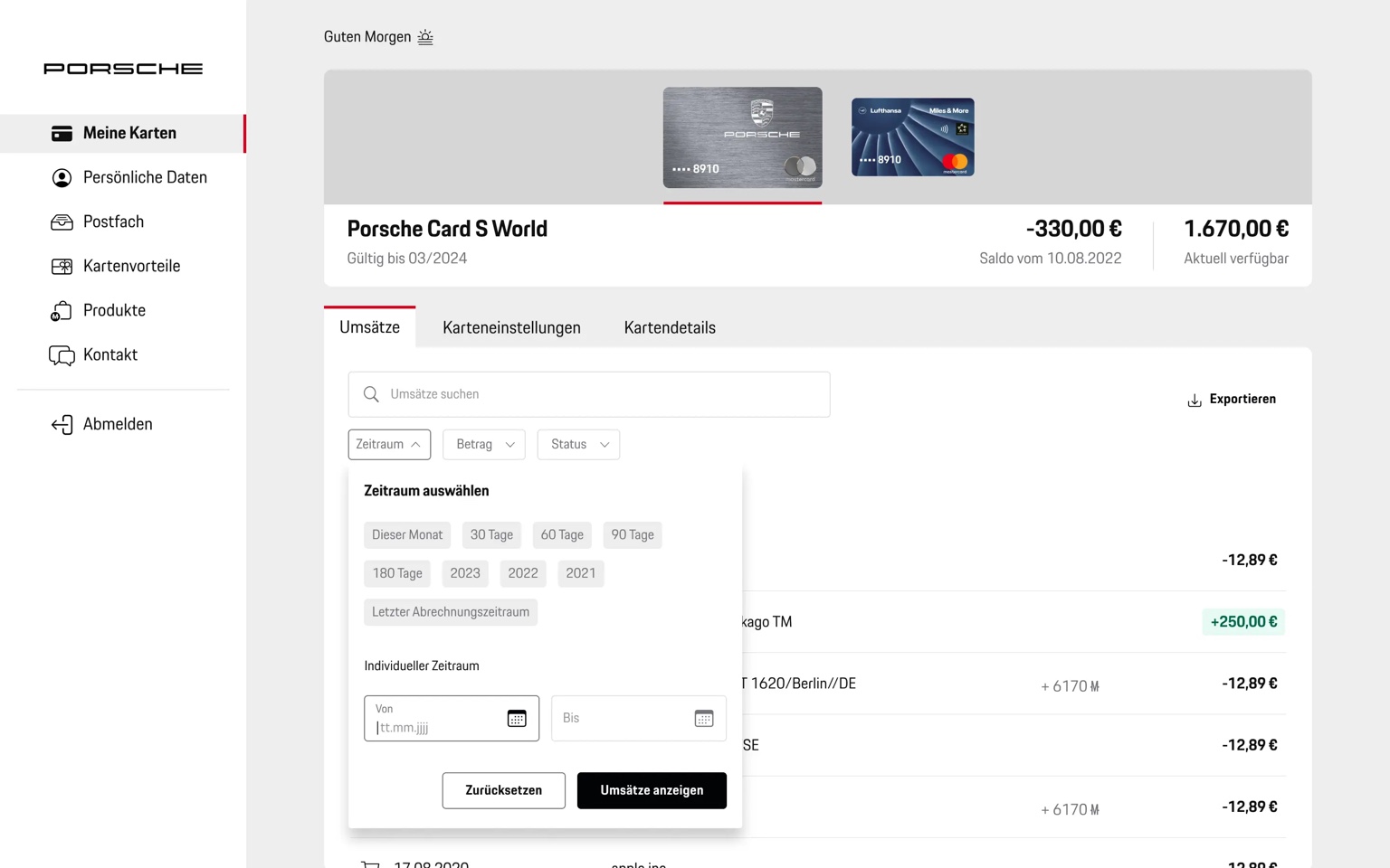
Search and filter logic
Transaction search and filter, layered filter system with progressive disclosure

Search & filter design

Transaction filtering in a credit card product is deceptively hard. Users need to combine date ranges, amount ranges, categories, merchant names, and card types across potentially thousands of transactions. The design challenge: make this powerful for the analyst, invisible to the casual user who just wants to find yesterday's coffee.

  • Layered filter system: quick chips for the most common use cases, advanced panel for power users
  • Progressive disclosure: complex filters surface when needed, not displayed by default
  • Active filter state permanently visible, with clear individual-filter removal affordance
  • Collaborated closely with engineering on filter persistence, URL state, and deep-link sharing
Full interaction flows are confidential. Happy to discuss the design approach in detail in a call.

How the IC and Lead roles connected

  • IC work gave me direct knowledge of the real design challenges, not a filtered, management-level view
  • This made feedback to the team more useful: I could point to specific problems and show alternative approaches, not just give abstract direction
  • Design system changes were validated on real IC work first, not in isolation from actual product problems
  • Staying close to implementation built credibility with engineers: decisions were grounded in technical reality, not just visual preference

Want to see more?

Open to Lead, Principal & senior IC roles, Amsterdam or remote across the EU.